Logo Design/Tagline Creation/Branding
When Moose Media approached me to create a logo and tagline for their brand, the vision was clear: to encapsulate their role as a bridge between the traditional and digital media worlds while staying true to their deep roots in Fort St. John.
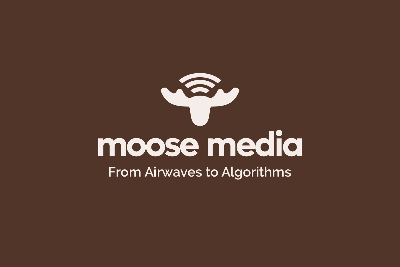
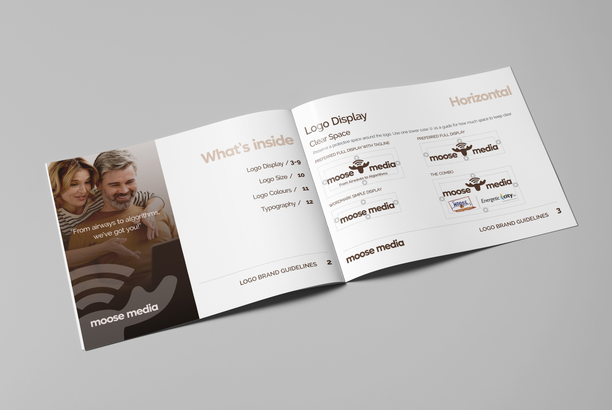
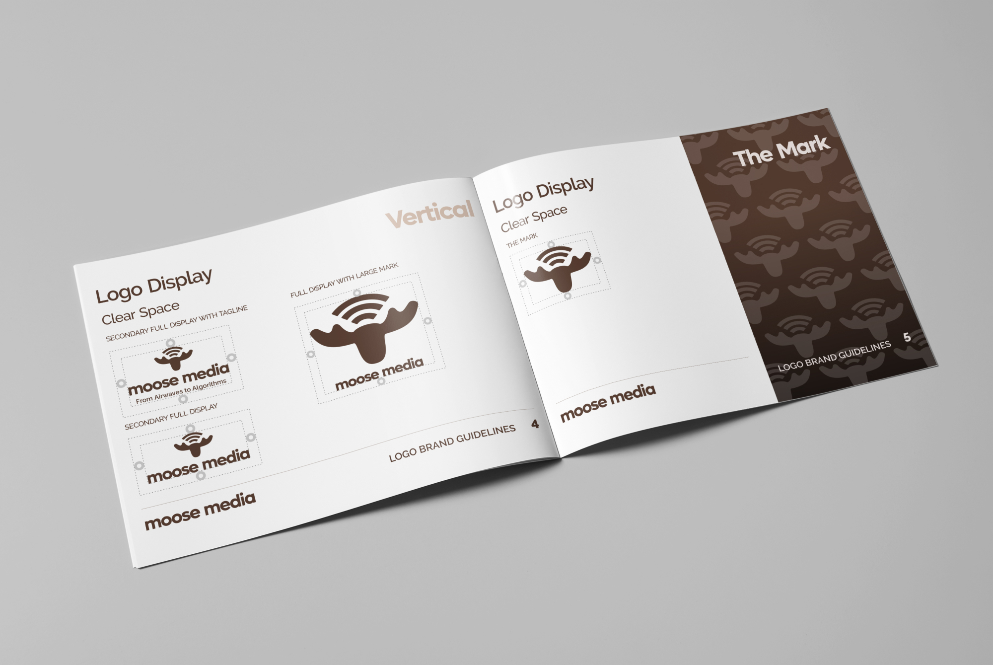
The Logo Design
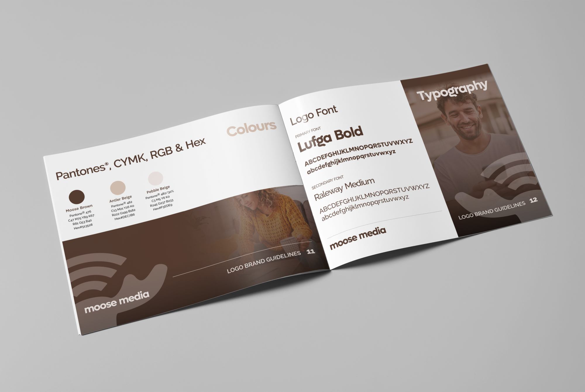
The logo features a sleek, modern interpretation of a moose head, symbolizing strength, community, and local pride. Adding a unique twist, the design incorporates a Wi-Fi symbol above the moose's head, subtly representing Moose Media’s commitment to connecting the community through both radio and digital platforms. The earthy tones of brown and beige evoke warmth, trust, and a connection to the natural beauty of Northern British Columbia, ensuring a cohesive and timeless aesthetic.
The Brand
Moose Media serves as the umbrella for two key entities:
Moose FM: The beloved local radio station that has long been the heart of Fort St. John, bringing vibrant music, engaging talk shows, and real-time news to the community.
Energeticcity.ca: A thriving digital platform that delivers the latest news, events, and stories, fostering connection and celebration in a digital space.
The Tagline
I crafted the tagline, “From Airwaves to Algorithms,” to reflect Moose Media’s comprehensive approach to storytelling and marketing. It highlights their ability to seamlessly integrate traditional radio with cutting-edge digital strategies, ensuring they remain at the forefront of media innovation.
The Impact
This cohesive branding captures the spirit of Moose Media’s mission: to inspire, inform, and connect the community through the power of media. The logo’s Wi-Fi symbol reinforces their role as a connector, bridging gaps and delivering content that resonates. The design not only honors their local roots but also sets the stage for their continued growth in both traditional and digital landscapes.
Moose Media’s story is one of evolution, resilience, and an unwavering commitment to Fort St. John—a perfect blend of community and innovation.