Logo Design/Branding Guidelines
The North Peace Community Foundation (NPCF) fosters a welcoming, inclusive, and diverse community in BC’s North Peace region. It unites financial resources to promote philanthropy and long-term opportunities for the community.
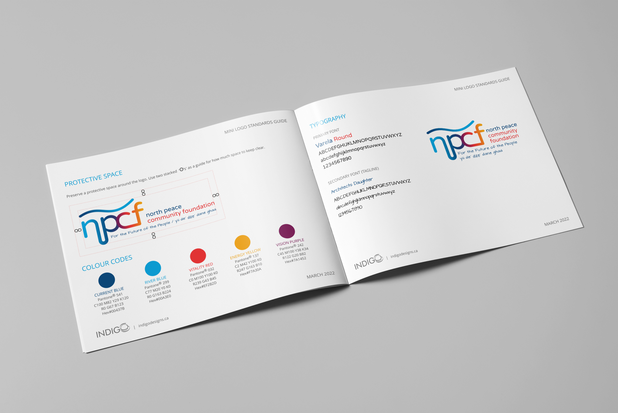
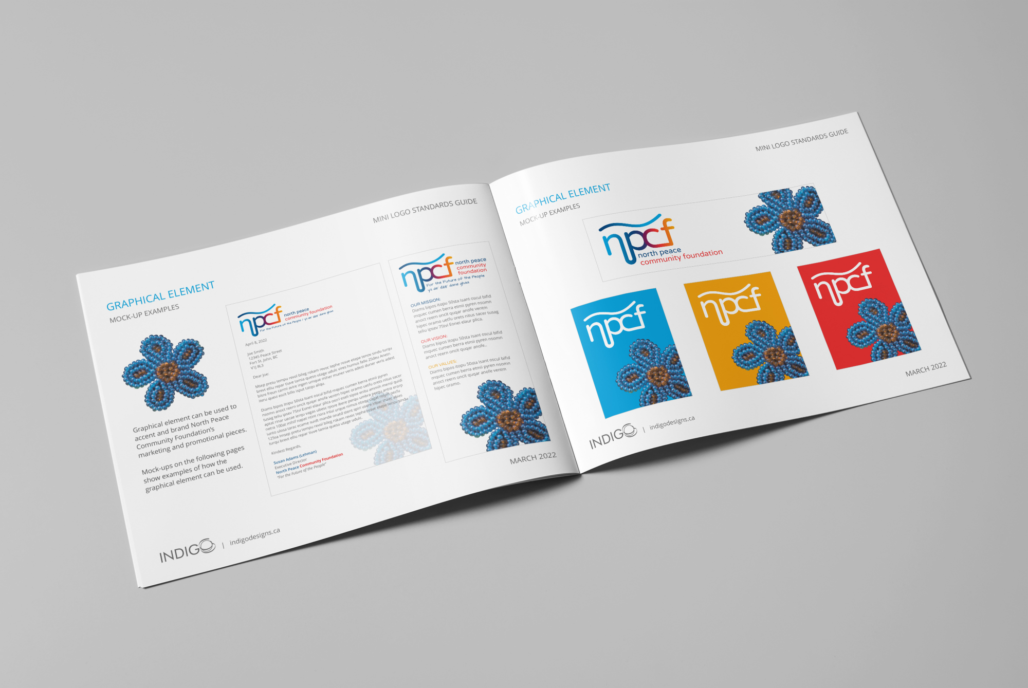
Logo Design Description: The logo features smooth, rounded initials that flow seamlessly, symbolizing unity and inclusivity. The vibrant color palette of blues, red, yellow, and purple represents diversity, inspiration, and energy. A graphical element of an Indigenous flower is incorporated to honor the Indigenous connection within this project. The clean, simple design ensures adaptability and timelessness.
Design Goals:
Unity and Flow: Interconnected letters reflect collaboration.
Vibrancy: The colors symbolize energy and diversity.
Simplicity: Ensures clarity and versatility for various applications.
Cultural Respect: The Indigenous flower element pays homage to Indigenous communities and their contributions.
The logo will be a key element across digital and print materials, ensuring a cohesive and professional identity.